Signs
Colours & Colour Matching
We hope the following information is useful and explains a number of important areas of colour management and considerations with printed colours.
Why do colours look different on a screen to that which is printed?
This assumption rears it’s head from time to time. A person has a seen a colour on their monitor or designed artwork on it and supplied the artwork to us. We print direct from the artwork sent as no colour references were supplied.
The printed item then differs from what they’ve seen on screen.
There are a few reasons for this difference but one of the main ones lies in the way that screens display colours.
- A screen uses an RGB (red, green, blue) colour model to create colours by adding light, whereas printing uses a CMYK (cyan, magenta, yellow, black) colour model by adding ink to paper.
- A screen is backlit which illuminates the colour. Whereas a printed item is illuminated in the same way.
Imagine this, you walk into a store which sells TV’s. There are 30+ TV’s around the store, all showing the same movie at the exact same point in time. Yet, each one displays the image in a slightly different way. One will be brighter, one will be darker, one will have a slightly warmer tone, one will have better contrast, colours will look more vibrant on another and so on and on.
This is because a whole host of variables like brightness, contrast, saturation, colour balance, colour temp and many other screen settings. These all alter the way the displayed colours appear to your eye.
So what you see on your screen might not even be the same as what you see on someone elses screen, yet alone a printed item.
We then add the fact that different manufacturers screens will display colours slightly different, and we’ve got a wider range of colours which may or may not match what’s printed.
The final bit of information, monitors are illuminated and print is not, seals the deal in this instance. It’s nearly impossible for a printed item to match a colour on a screen without a lot of colour calibration on a screen.
Hopefully this helps explain why looking at a colour on your monitor (which is illuminated, and has all the different settings which alter the colours) and expecting printed colours to match isn’t realistic.
Choosing a colour from what you see on your screen is not a reliable way to pick the colour for your sign / printed colour and we strongly recommend against it.
So what’s the solution?
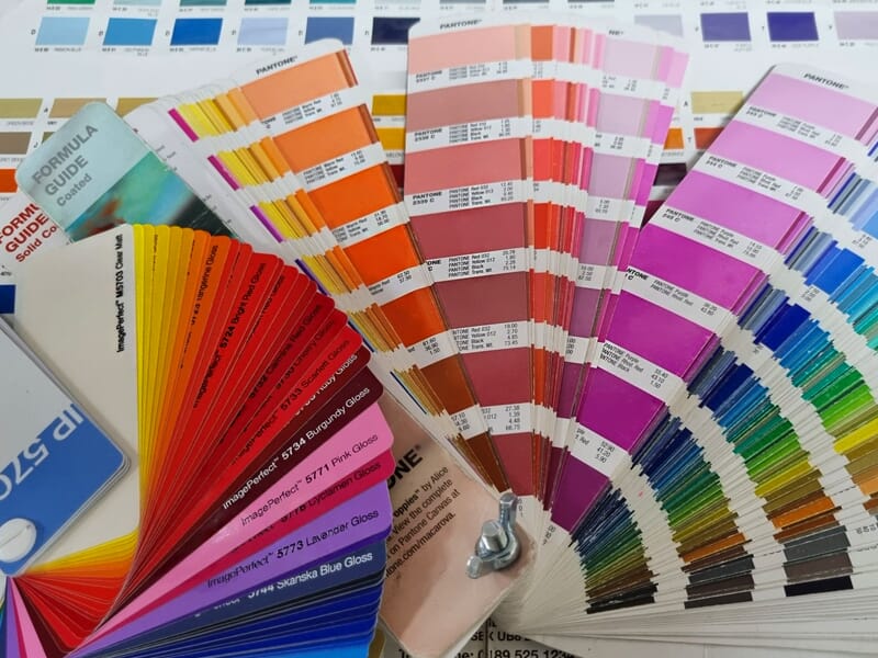
Pantone References for Closest Colour Match
If you want to achieve a specific colour, we recommend using Pantone references.
Pantone is a system that uses a standardised set of colours to achieve consistent colour reproduction across different mediums. By using Pantone references, we can ensure that your colours are matched as closely as possible between printed materials.
We have pantone colour books, and if you’re able to come in you’re more than welcome to pick a colour from them.
CMYK Printing. The Differences Between Machines & Materials
You may have heard of four colour process printing, commonly known as CMYK (Cyan / Magenta / Yellow / Black).
The colour references are made up of four numbers which each represent how much ink is to be used. So a CMYK reference of 100/50/100/20 would be 100 Cyan, 50 Magenta, 100 Yellow and 20 Black.
Give two different printers the same CMYK reference and it would be easy to expect an exact match on what comes out. Right? I mean… why wouldn’t it?
Unfortunately, in reality it doesn’t work that way as CMYK references are simply the amount of ink you’re telling the printer to use.
A CMYK color reference can look different when printed onto different materials because each material has different properties that can affect how ink is absorbed and reflected.
For example, glossy paper will reflect more light than matte paper, which can make the colors appear brighter and more vibrant. Similarly, the color of the material itself can affect how the ink appears. Printing the same color onto a white material versus a dark material can result in a noticeable difference in the final color.
Additionally, the brand / type of ink and the printer model used can also affect the final color.
Different brands of ink or different batches of the same ink can have variations in colour. A reference of 20/20/20/20 on our printer may look different to 20/20/20/20 on someone elses printer.
The printer itself can also affect the final color, as each printer may have slightly different settings or calibrations that can affect how the ink is applied to the material.
To minimize these variations and achieve the closest possible color match, we recommend supplying us with a standardised color reference like Pantone.
If colour matching is really important to your order we would suggest requesting colour samples from us prior to production to ensure that the color is acceptable.
Colour Matching Limitations Disclaimer
Please be aware that when you supply colour references to us we will strive to achieve the closest possible colour match, but there are limitations to what we can achieve even with a pantone reference.
Most printers can match about 70% of pantone references, but some of the more obscure ones (super vibrant / fluroescent colours) will be beyond the capabilities of most printers.
The colour accuracy of your printed materials may be affected by a variety of factors, including the type of substrate used, environmental lighting conditions, and individual printer settings.
Additionally, colours may appear differently when viewed under different lighting conditions, such as natural sunlight versus artificial indoor lighting.
While we cannot guarantee an exact colour match, we will work with you to achieve the closest possible match.
We hope that this information helps to clarify any questions or concerns you may have about colour matching.
If you have any further questions or would like to discuss your specific colour matching needs, please don’t hesitate to contact us.
Very quick summary of how to help us get the best colour match
1 – Please supply us with pantone references.
2 – If not CMYK references would be great (acknowledging the above).
3 – If your colour needs to be absolutely perfect, then request a colour sample (charges may apply depending on circumstances)
Thank you for choosing Signet Signs Ltd.
We’d love to hear from you
If you’re looking to get started with a new project, or you want to discuss some options, get in touch with our friendly team:
Enquire Today
Why choose Signet Signs?
We are a family run signage company, established in 1971, and are proud of our long standing reputation for exceptional customer service.
Whatever your signage projects requirements, we promise to provide a transparent experience and to keep you fully informed every step of the way.


